
In order to further expound on the topic of digital transformation with Data Visualization, we are going to examine a few different types of technologies and practical examples. To start, making complicated graphs and pie charts from scratch can be a significant development effort. Luckily, there are many technologies available that allow us to “plug and play” data into a visual framework. We won’t go into all the different options here like using Tableau or popular Javascript libraries, as we could devote an entire blog post to that. But it’s helpful to keep in mind that the development of data visualizations doesn’t have to start from scratch. These tools can save you a lot of time and money. But remember, going through a discovery process to identify the right data to visualize is important.
Create an Active System With Actionable Results
If Data Visualizations are done right, a set of data or a system can be visualized and monitored to form a feedback loop with users that provides actionable results. The entire system itself becomes active instead of passive. Instead of a collection-based data system, you now are doing something with that data, which makes it active and engaging.
Below are a few examples which highlight some exciting Data Visualizations that Productive Edge has created with our partners.
Research Study Data Visualizations
We helped create software for one of the top sports organizations in the U.S. to track a multi-year research study specifically related to a popular surgery that lengthened players careers.
In Discovery and Design, we learned that research study leaders wanted to see how many patients were in the study and their progress. Traditionally, in university settings, this is a very manual process, sometimes still done with paper and pencil.
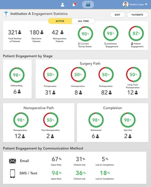
We created this Engagement Statistics page for doctors to see rolled up data on how their research participants are engaging with the study.
Up at the top are the Patients and Engagement rates, with a toggle to switch between Active and All patients. The second set of data shows how many patients there are and where they are in the process. This data is easy to scan and easy to read.
At the bottom is data showing engagement rate by device type, so users will know what communication methods are working best. This is also listed on Patient pages so doctors will know how to better interact with individual patients.
This visualization allows the doctor to see all the patients in their study and their progress on one screen without having to create any reports. And each graph and statistic is clickable to let the user drill into the data element for more detail. This useful tool helps facilitate the appropriate follow-up actions by doctors.
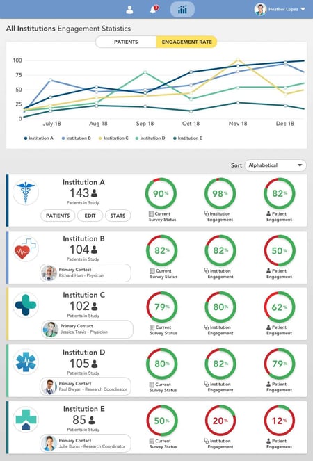
The data visualization above shows all the institutions in the study and how they compare with one another. This lets the primary doctor in charge of the study visualize how all the different institutions are doing compared to each other and if institutions or their patients are falling behind in the study. The visualization also includes the contact information for each institution in one place to make following up easier.
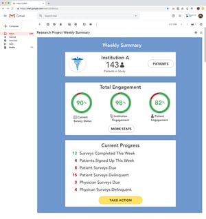
The above stats were rolled up into a report that is emailed every week, so the doctors don't have to log in to see progress. Doctors are very busy and frequently on the go, so a weekly summary provides a lot of value.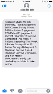
Doctors could also opt into a weekly text message displaying similar data points as in the email.
Seeds
The founders of Seeds came to Productive Edge with nothing more than a vision: a mobile application that enables people to make the world a better place through charitable giving. After engaging in an extensive discovery phase, we designed an application for iOS and Android to connect users to charities.
Most importantly, the application visualizes the impact of a person’s efforts, which encourages others to take the initiative as well. This application is a premier example of how technology solutions can improve the world around us in tangible ways.
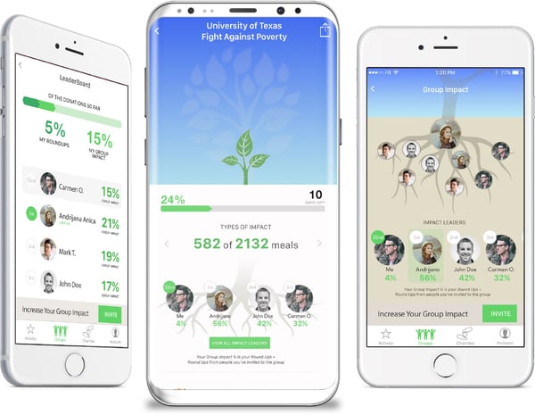
Types of Impact is one of the coolest visualizations. When users donate, they can see exactly how they helped others, such as how many meals, gallons of water, surgical blankets, or first aid kits their gift provided.
Also, users can visualize how close they are to their goal by watching their seed grow into a tree. The roots of the tree visualize how a leader of a group has helped others in their group reach for the same goal.
This is an example of a data visualization feeding the primary experience of an application with stunning, engaging graphics.
Conclusion
Part of successful Digital Transformation is creating data visualizations that can greatly enhance how a system performs. We can gather enormous amounts of data that can be connected, and data visualizations can give us the ability to discover relationships that weren’t visible to us before and help us understand (or “see”) if we are achieving our software’s primary goals. Contact us to consult on a digital strategy tailored to your business and jumpstart your digital transformation journey today.