
Accessibility is a set of qualities that make an experience open to all. In short, accessibility is an attribute, but inclusive design is a method. They are different, but inclusive design should always start with a solid understanding of accessibility fundamentals. This is an incredibly rich topic and it is important to start with the basic items that scratch the surface for just how critical designing for accessibility is.
Alt Text
Alt-text is an attribute that goes on an image tag. It helps people with visual impairments and is read by screen readers, but it’s also where the image description comes from if an image doesn’t download. An image might not load because of a poor network connection, file naming errors, or many other factors. We’ve all seen something like this before:
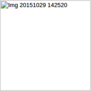
This image failed to load and had no helpful alt text. This is what we don’t want.
But sometimes, we don’t need alt text at all. This can be if the image is purely decorative, or not adding anything meaningful to the content of the page. In the following example, the text already describes what the image is representing.
Duane Underwood Jr, a pitcher, is the youngest player for the Chicago Cubs.

alt=””
The image doesn’t add any information that we could not otherwise find. In this case, the attribute is still necessary but is simply filled with empty quotes. This is important because it tells screen readers to skip this image. If there is no alt attribute, some screen readers will read the name of the file. As we can see from the first example (Img 201511029 142520), that would just be cognitively noisy and jarring.
Writing a good alt text never harms a product and should be considered by everyone, not just designers or developers. It is also an art, not a science. Good principles to stick by are:
- Always have alt text, even if the quotes are empty
- Be clear, avoid jargon and idioms
- Don’t be redundant
Biases
There are some questions we should consider in order to design better products. Some basic questions to start with may be:
-Is the product being tested by a diverse set of users?
User testing participants should always represent a wide range of demographics that are a true representation of your target audience, including users of varying age, technical ability, gender, ethnicity, and other biographical data.
-Is the same content available across all platforms?
A user’s choice of the device should not limit the content they have access to. Ensure that the same information is available across all versions of your product, including mobile and desktop platforms.
-Do images & graphics represent a diverse set of people?
Use stock imagery and graphics that represent a variety of ethnicities, ages, disabilities, etc. Users want to feel represented and included.
-Does the copy make assumptions about the users based on race, gender, ethnicity, class, or other traits?
If you need to ask users for sensitive or personal information, make sure to provide options that represent all of the desired responses. It is also advisable to include the ability to decline to answer when possible by including options such as “I’d rather not say”. Users who feel included and represented are happier, and a more granular set of responses will provide you with better data.
-Are we using gender-neutral terminology whenever possible?
Make sure to be as neutral as possible when asking for information or when addressing users. When possible, either use data gathered from the users themselves or avoid gender-specific pronouns entirely.
Content
Finally, some basic guidelines for creating visual assets that aren’t exclusionary:
- Make sure there is enough contrast between the text and its background-color
- Don’t indicate important information using color alone
- Help users understand inputs and help them avoid and correct mistakes
- Pair values of color together, not only different hues
- Touch targets on mobile should be 48 x 48 dp. If your icon is 30 x 30 dp, then add 18 dp padding
- Be consistent across functions, placement, and labeling
None of us are against inclusivity. But we can be more conscious of the decisions we make that can raise or lower barriers to participation. This starts with proper customer insights to elevate the customer experience by designing for accessibility. To learn more about this topic, check out our latest eBook: Using Customer Intelligence to Create Better Experiences