
The Health/Tech Blog
Dive into the latest and most exciting developments in AI, data, and healthcare technology.

ROI or Bust: How to Measure the Real Value of AI in Healthcare
Healthcare leaders are under pressure. They’re being told to cut costs, adopt AI, and demonstrate its effectiveness. But in a sea of bold claims and limited evidence, how can anyone measure whether an AI investment is actually delivering? ...

Azure Data Lake Best Practices for Healthcare Leaders

How Agentic AI is Changing Care Management

May 2025 CMS Policy Updates: What Payers and Providers Need to Know

Season 2 / SITECORE
The changing role of the CMO in healthcare
Watch Video

Season 2 / CENTRAK
Realtime location solutions for healthcare
Watch Video

Season 2 / PE
Generative AI in healthcare: risks and rewards
Watch Video
Season 2 / SITECORE
The changing role of the CMO in healthcare
Watch Video
Season 2 / CENTRAK
Realtime location solutions for healthcare
Watch Video
Season 2 / PE
Generative AI in healthcare: risks and rewards
Watch Video

PARTNER / REDOX
Up in the Cloud: Future-Proofing Healthcare Data with Cal Harris
Watch Video

Season 2 / Episode 1
The Johns Hopkins ACG® System And Its Impact On Population Health Management with Sarah Kachur
Watch Video

Season 1 / Episode 4
Dr. Arif Nazir of BrightSpring Health discusses the role of technology in healthcare
Watch Video

Season 1 / Episode 3
Amy Berk MSN RN of Microsoft Discusses Population Health and Value-Based Care
Watch Video

Season 1 / Episode 2
Josh Williams, Director of Strategic Initiatives at CEOc
Watch Video

season 1 / episode 1
Opportunities for Healthcare in 2023
Watch Video

Fixing Prior Authorization: What the New CMS and HHS Pledge Means

Using the Quintuple Aim to Shape an Effective AI Strategy in Healthcare

A Welcome Push Forward on Health Engagement
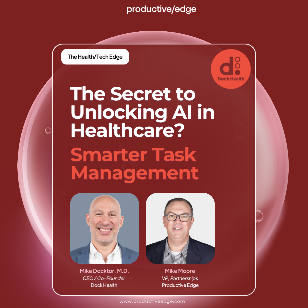
Unlocking AI in Healthcare with Smarter Task Management

How AI Agents Are Unlocking 24/7 Patient Support